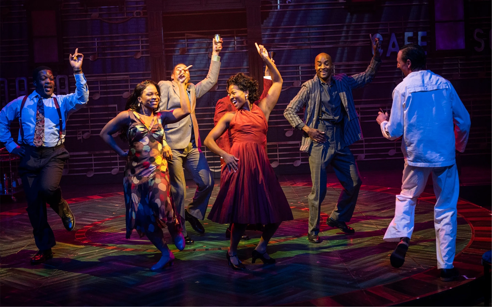
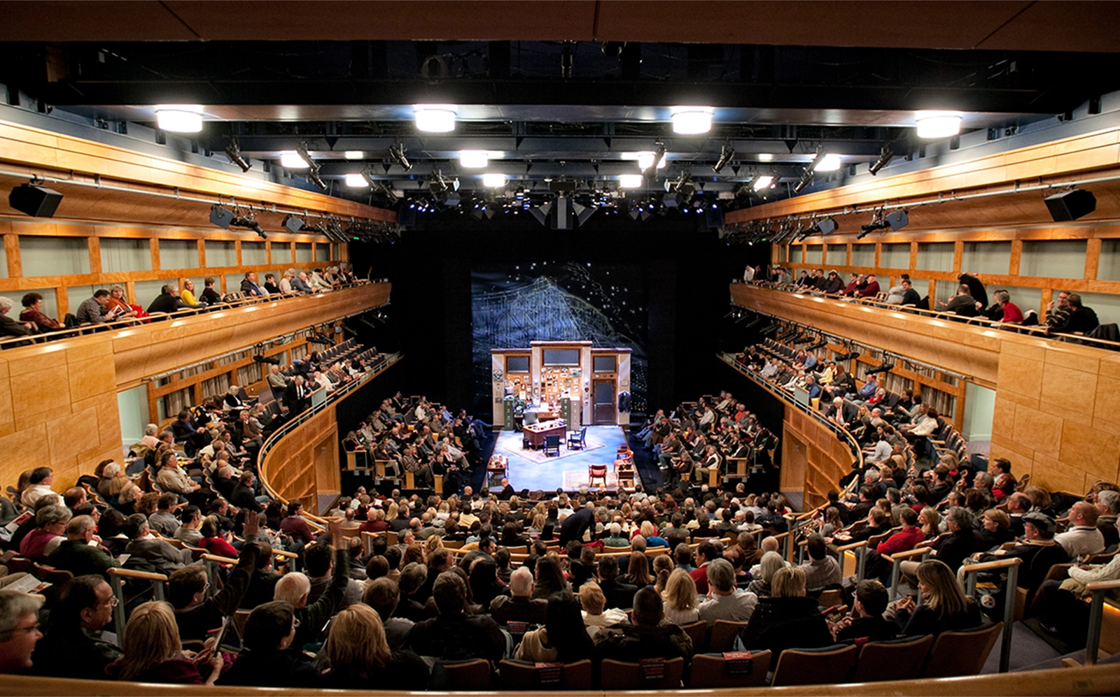
The Pittsburgh Public Theater is well-recognized for having premiered many August Wilson plays as well as for its dedication to its tradition of producing new work. It serves as one of the most prominent theaters located in the heart of the Cultural District to be serving up new and diverse theater.
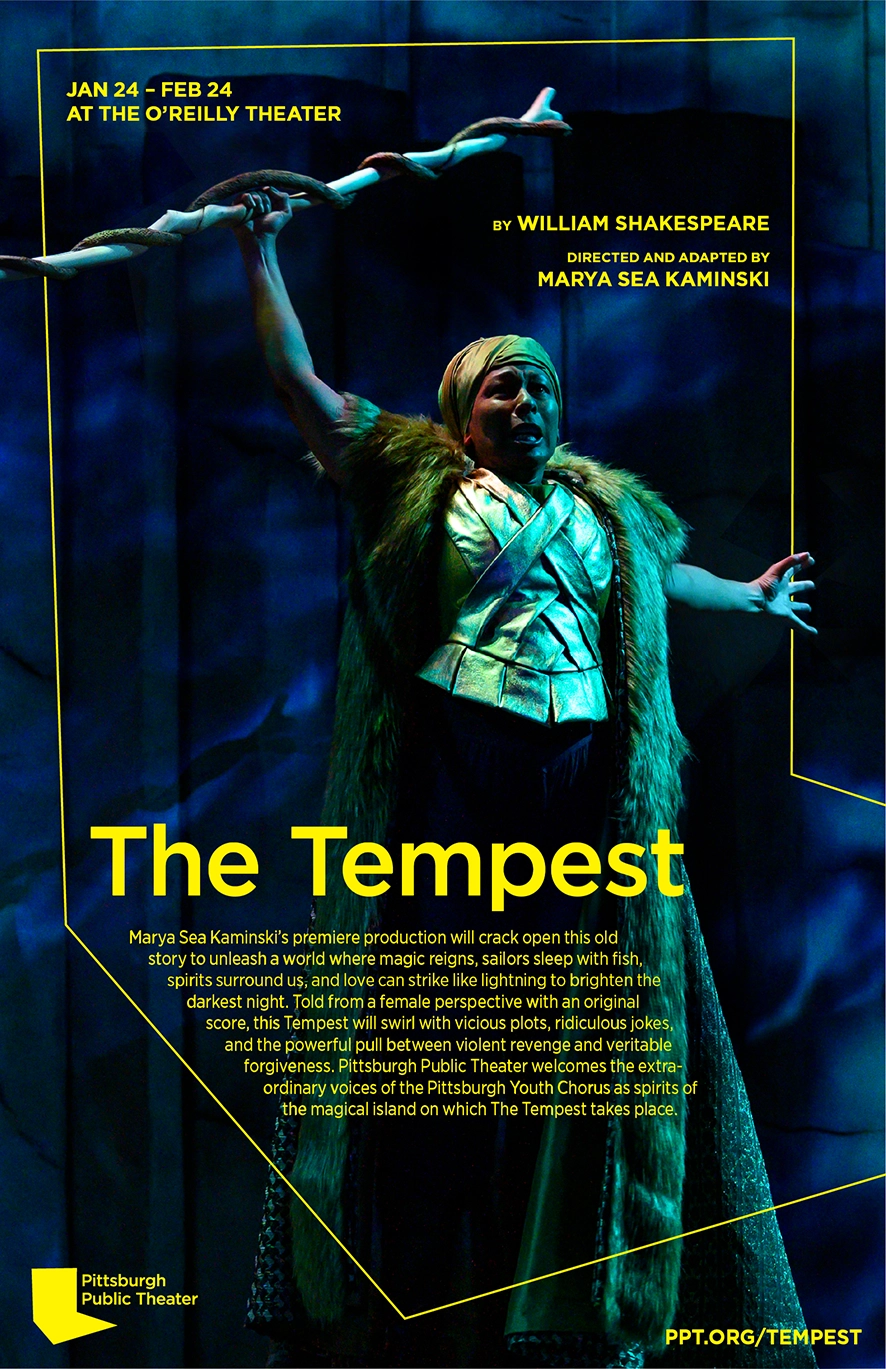
Before I had arrived at Pittsburgh Public Theater, I was alerted that the company had already hired an external design company to revitalize the brand of the theater and design the next season's art. This is a purely theoretical project if they had asked me to rebrand the theater instead and what I would have chosen to do.
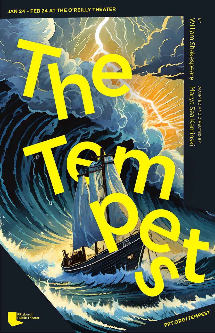
My rebrand focuses on the unique qualities of this regional theater by designing a logomark and extended brand identy evoking its avant-guarde nature and tying the theater company closer to its location and distinctive stage.
Project info
2022, Branding
Before I had arrived at Pittsburgh Public Theater, I was alerted that the company had already hired an external design company to revitalize the brand of the theater and design the next season's art. This is a purely theoretical project if they had asked me to rebrand the theater instead and what I would have chosen to do.
My rebrand focuses on the unique qualities of this regional theater by designing a logomark and extended brand identy evoking its avant-guarde nature and tying the theater company closer to its location and distinctive stage.
Project info
2022, Branding